


Products
Shop
Pages

PROJECTS > DESIGNER INTERVIEW – SEAN CHAN
Flat Office – Interview with Sean Chan
State Twenty Eight
Perth, WA
Jack Lovel
2026
#####
MLP Light
Interview
Designer Q&A with Sean Chan
We spoke with Sean Chan from State Twenty Eight Interiors about a unique office space they have recently designed - Flat Office.
“Beginning with Flat Beat by Mr. Oizo as its sole creative reference, Flat Office transforms rhythm into architectural language. Repetition establishes order, while deliberate interruptions generate moments of surprise through form, colour and detail. The result is a workplace where music becomes space, creating a distinctive environment with clarity, identity.”
MLP - If you had to describe the feeling of this office rather than what it looks like, what would you say?
SEAN - Fun. It’s a very simple word, but I think it sums it up. Looking at the client and who he is as a person, he’s a fun guy, and his brief was never going to be traditional.
There’s also quite an intimate feeling to the space. It’s his office, but he isn’t in there constantly, so it was a really cool opportunity to create a workplace that didn’t necessarily feel like a workplace.
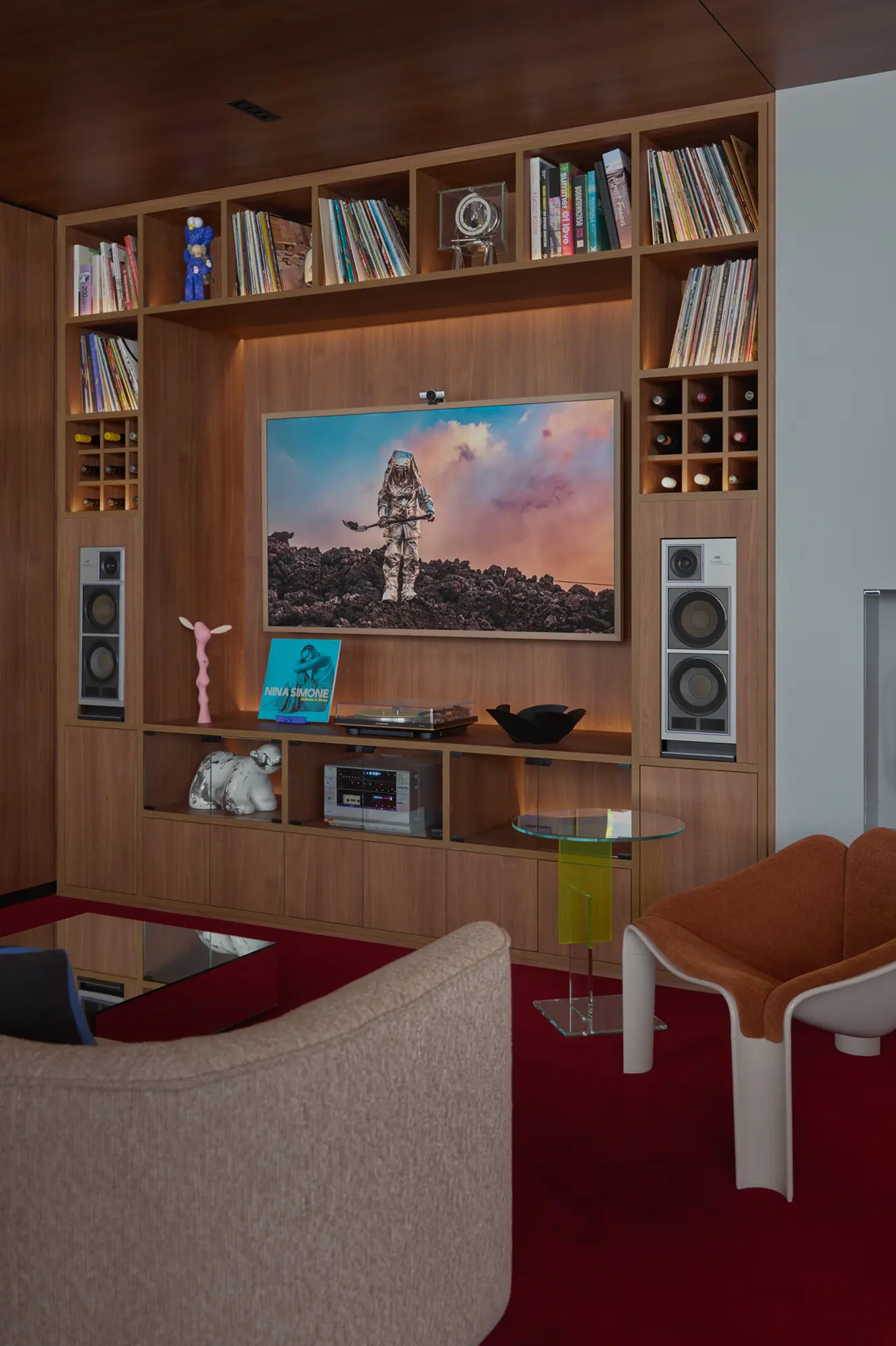
One of the functional requirements was lots of record storage, but beyond that, the brief was really about creating something that felt different.
Was there a particular era or aesthetic that you kept coming back to during the design process?
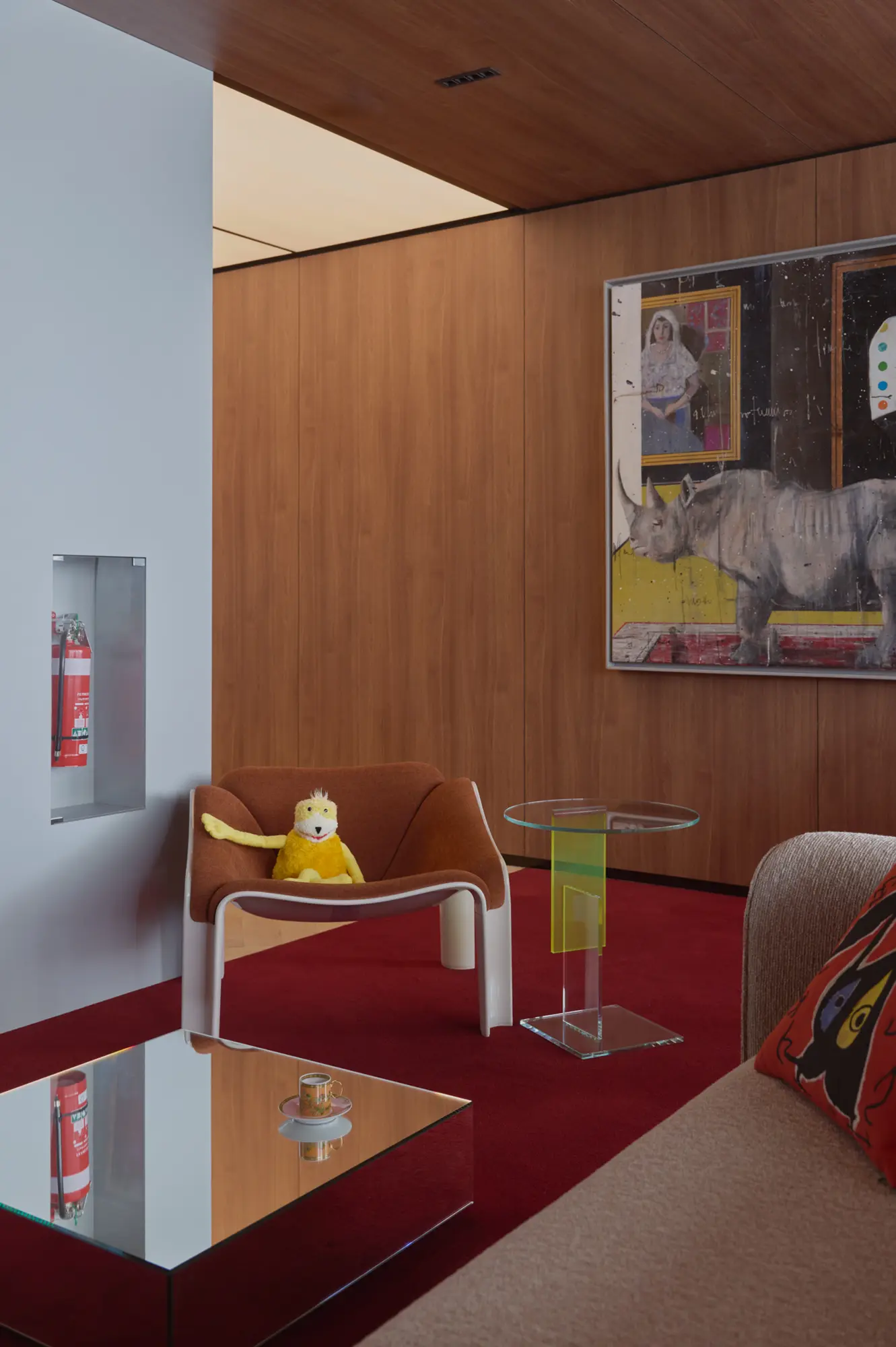
It was very much that mid-century, 1960s era. I knew the client was a fan of that period and he has a Master’s in Architecture, so I knew that using certain cult classic pieces would really resonate with him.
It started with what he wanted, and then I intertwined that with my own design approach. There are lots of mid-century references throughout the space, which he obviously loves.
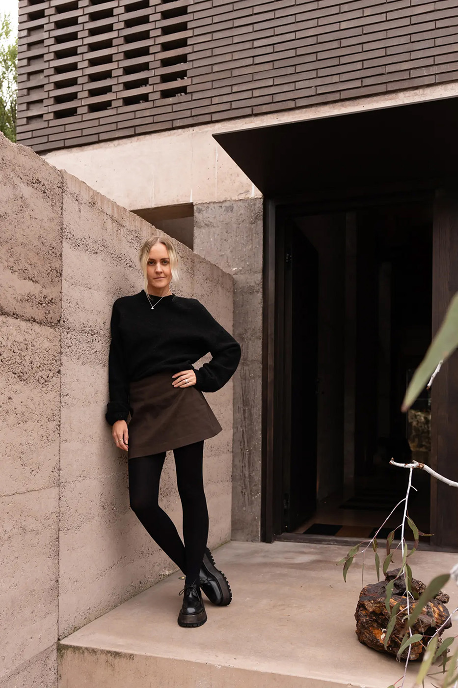
DESIGNER SEAN CHAN
Did you have any references that weren't necessarily interior design references? A hotel, restaurant, film or music, for example?
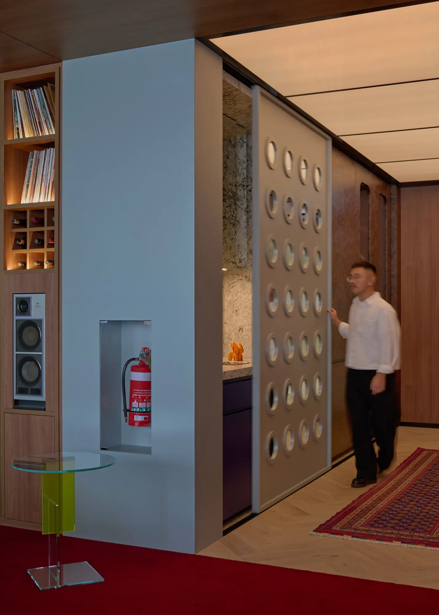
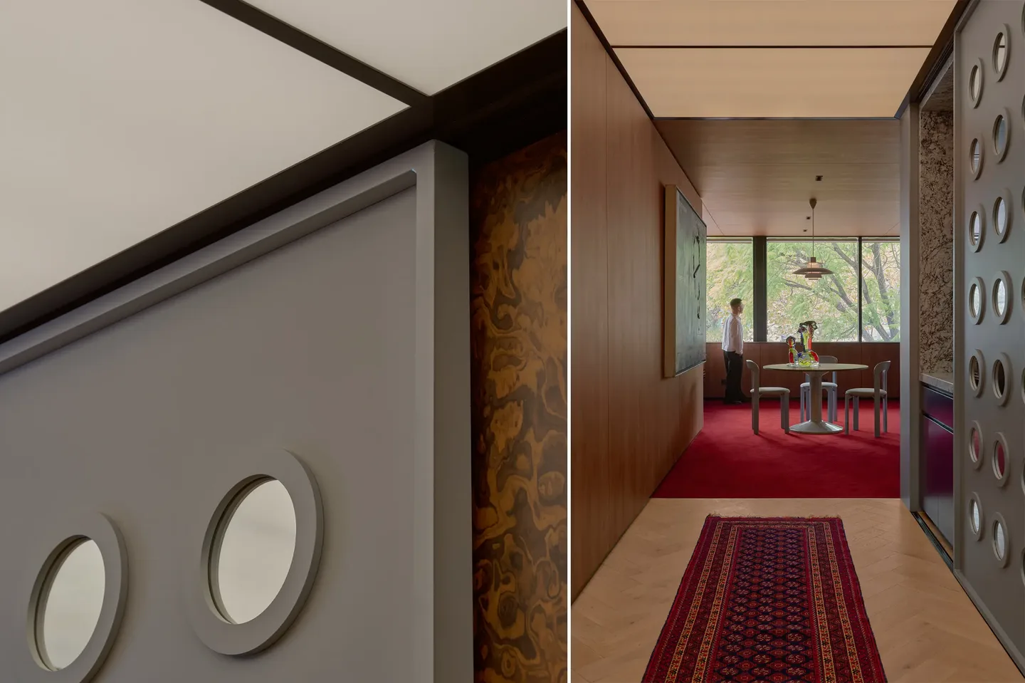
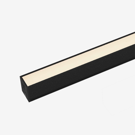
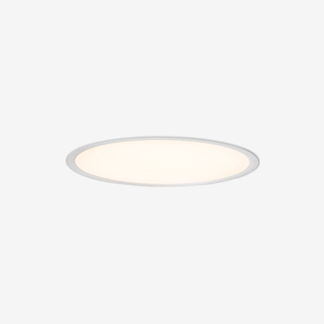
There were quite a few. When you enter the office, the inspiration for the light box ceiling we created with MLP came from the bunker in The Dark Knight Rises. It’s essentially pure light, with no shadows.
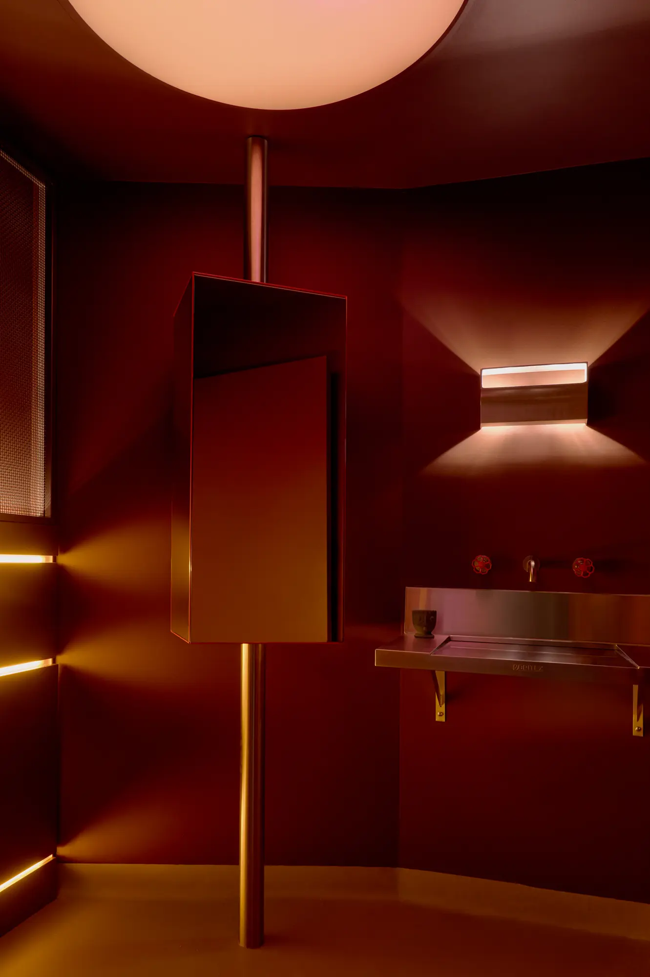
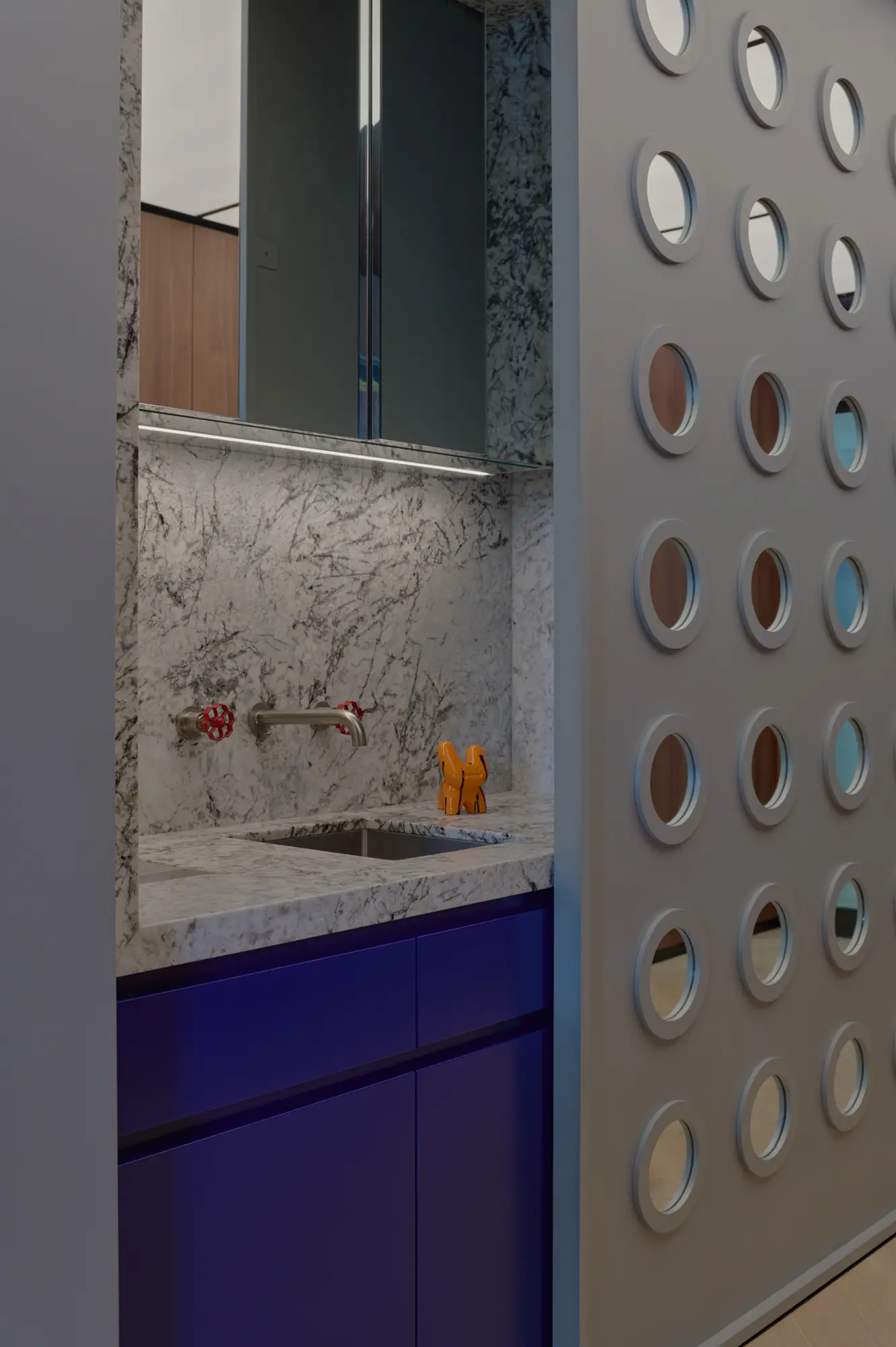
For the bathroom, the reference was Tron and Blade Runner 2049. The client is quite a big movie buff, so I wanted to use those references subtly throughout the space.
The record player was also referenced from American Psycho, so there are lots of little things here and there that I thought were really cool.
Music was obviously a big part of the brief. How did that influence the design?
The client is a real pop culture buff, so he appreciated all those little references. Flat Beat was obviously a pretty heavy reference for the job.
It wasn’t about directly recreating the music video. The whole concept was actually based on the beat and rhythm of the track. It has this very glitchy sound, and I wanted to translate that into an interior space.
That’s why a lot of the space looks slightly funky and unusual. Those were my interpretation of the glitches.
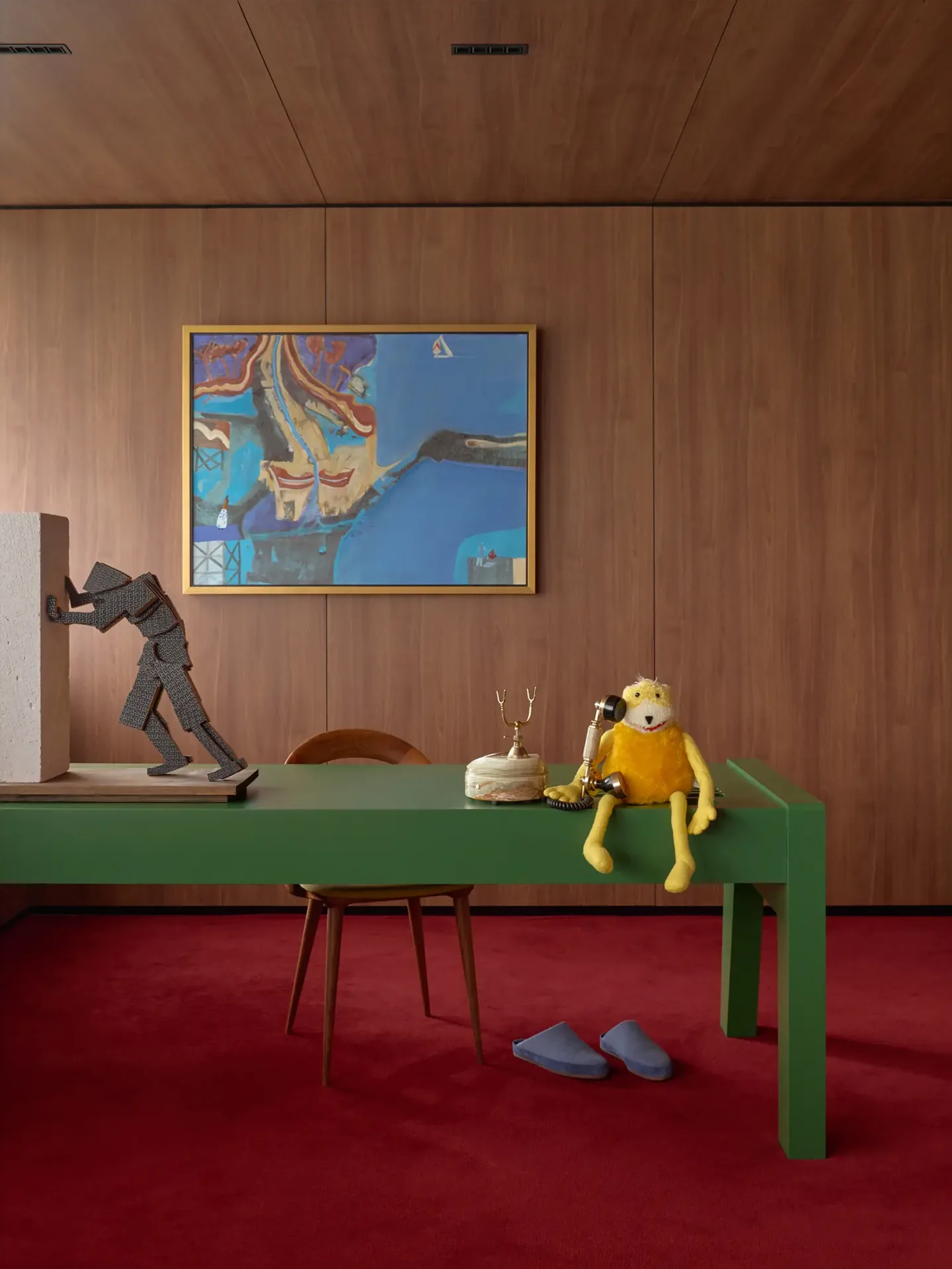
For those glitches to work, everything else needed to be really precise. You can see that in the join lines throughout the space. The walls, ceilings and junctions all align perfectly, and then the unusual colour and material combinations become the glitches.
That was essentially my interpretation of what that rhythm could look like as an interior.
How did you approach the lighting given all the different material textures in the space? Were there finishes that became particularly interesting once they were lit?
There was one very specific finish I was interested in with the light box above the wardrobe. It’s a burl veneer on the wardrobe as you enter.
We did a lot of testing with different gloss levels, and ultimately landed on around 10% gloss. The way the light shines across it picks up all the different variations in the burl. It’s difficult to explain, but it’s just perfect.
That helped inform a lot of the detailing of the custom elements throughout the space.
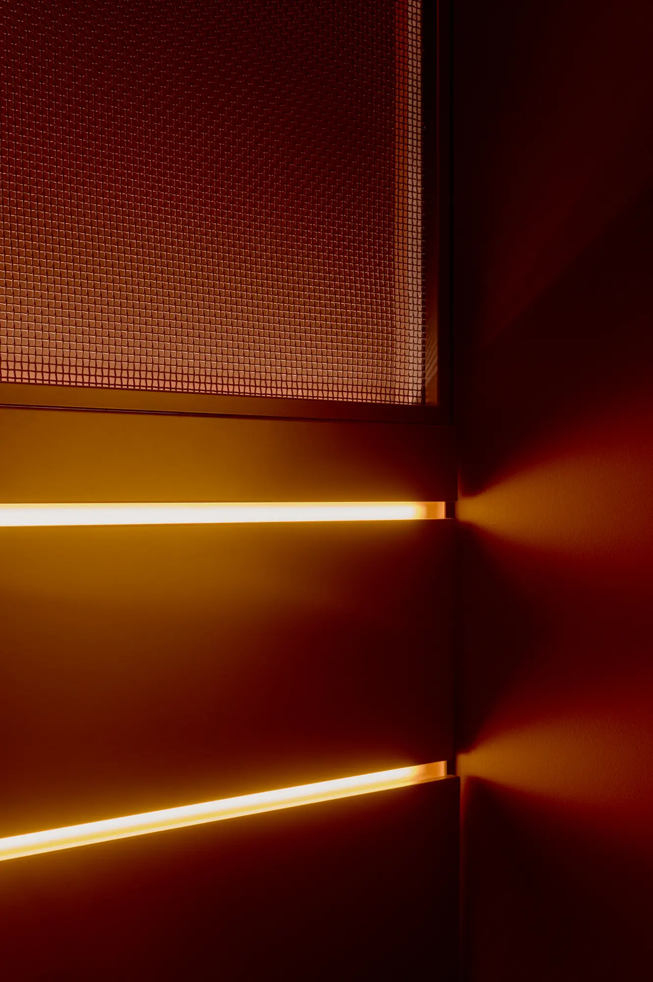
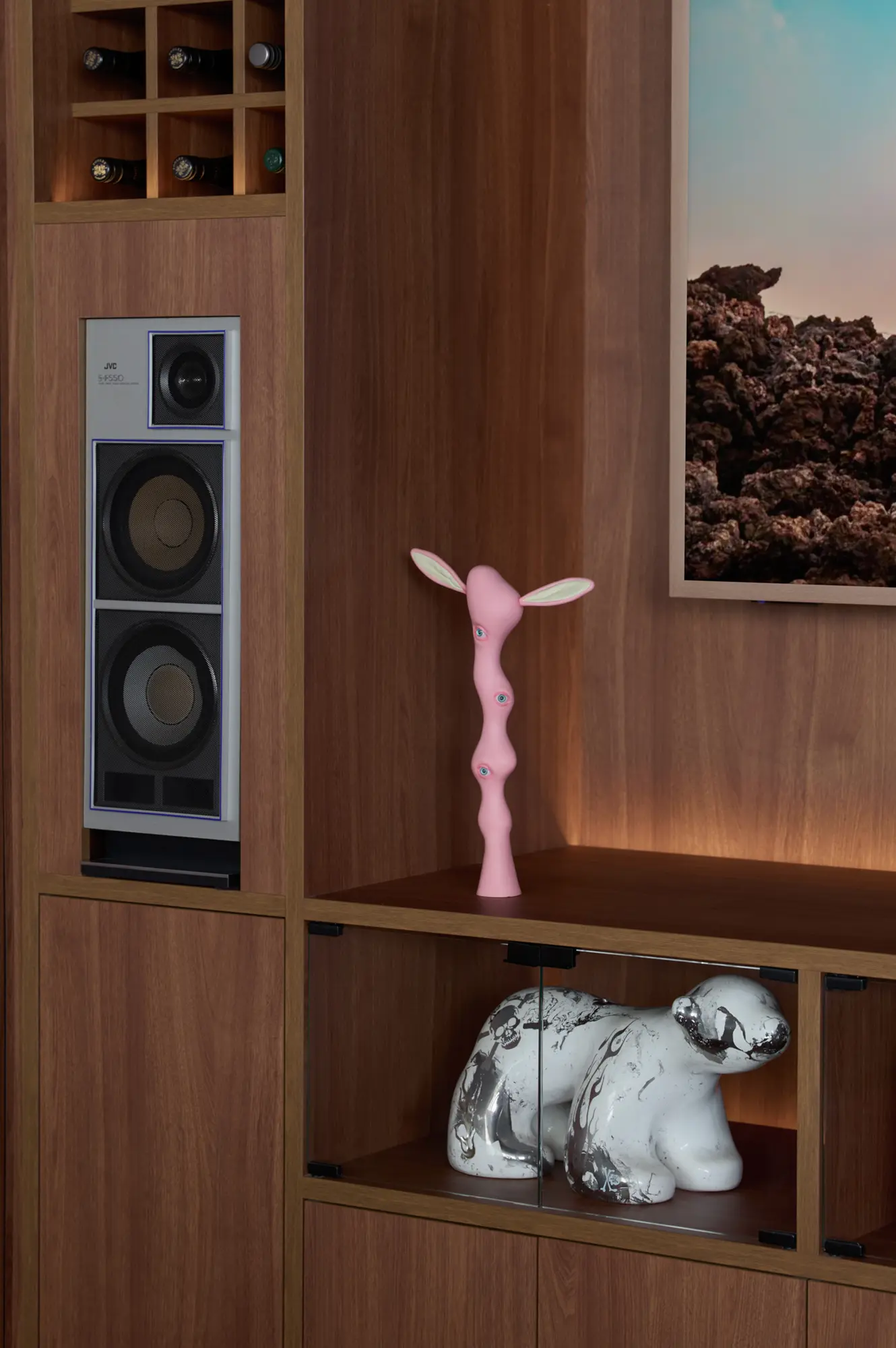
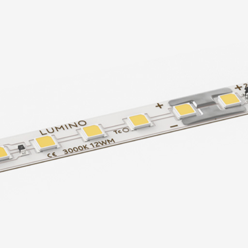
I also asked MLP quite a lot of questions around wattages and how to specify the different areas for the LED lighting. I had concerns about heat from the LEDs, particularly around the record storage, so getting the technical input on that was really useful.
Is there a particular lighting moment in the project that you're especially proud of, or that completely changes the way the space is experienced?
There are two very similar moments: the light boxes in the bathroom and the entry.
With the colour temperature and brightness of the light box in the entry, everything feels very surreal. The way it picks up the powder-coated metal door just doesn’t feel real. It’s rdifficult to explain until you actually experience it.
Because there are no shadows and it’s so bright, it has this strange, almost unreal quality. Then, as you dim it down, it starts to feel like a normal space again.
Conversely, the bathroom is very dim with a warm light, which was obviously referencing Blade Runner. It feels like this little dystopian area within the office.
I think those are really cool spaces where the lighting plays a huge role in how they're experienced.
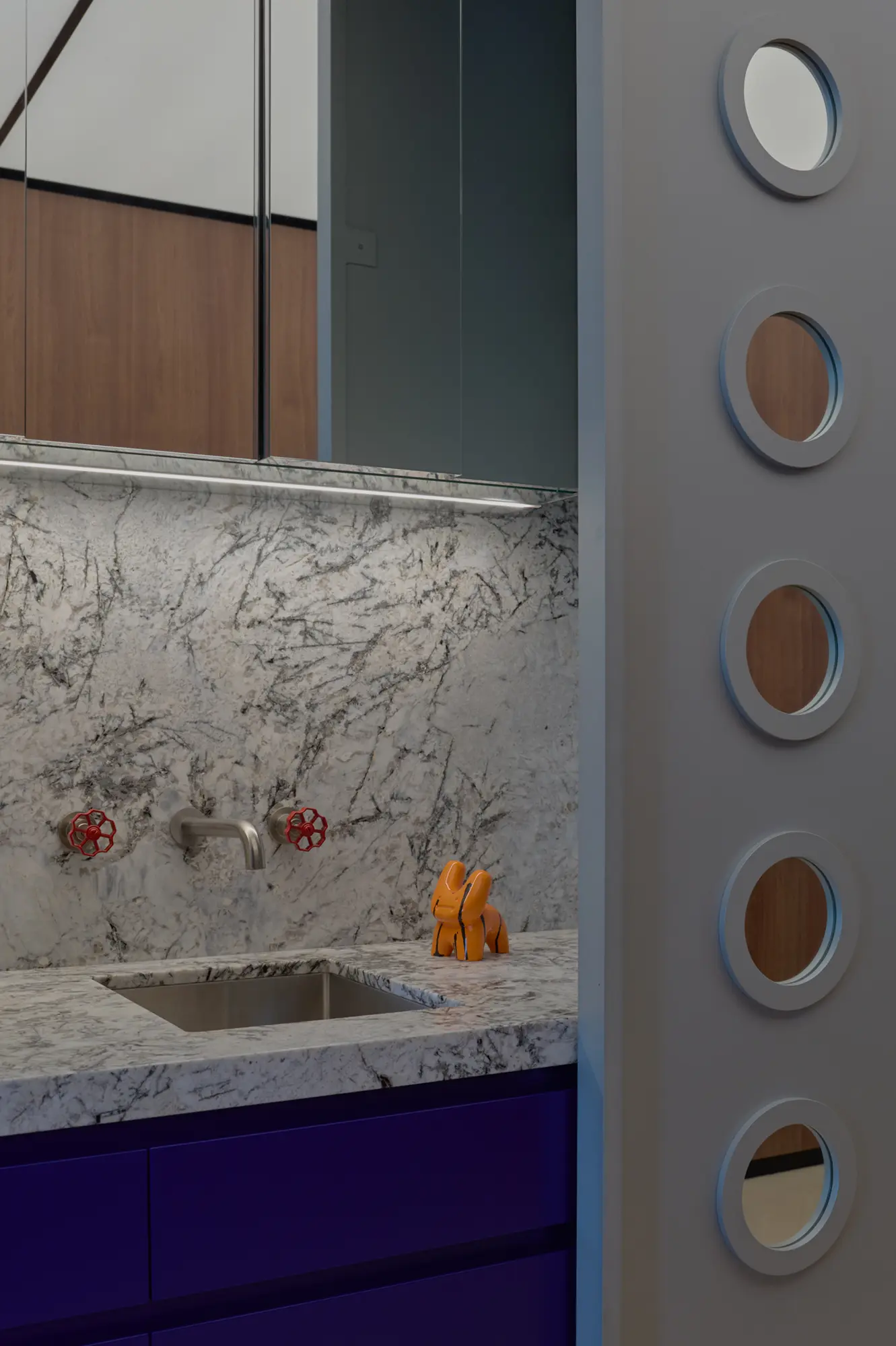
How did you use light to create hierarchy within the different areas of the space?
MLP helped me a lot with that. I had an idea of where I wanted things to be functional versus atmospheric.
Over the task areas, the lighting is essentially a spotlight. Above the TV area, most of the light comes from the record storage area. Then the entry is just pure light box.
I think I was able to get away with such a dramatic entrance because it’s relatively far away from the task areas, so it doesn’t impede the functionality of the workspace.
MLP helped to specify all of those elements and make sure the lighting worked technically as well as atmospherically.
The physical light fittings are quite restrained. How did you approach the fixtures themselves?
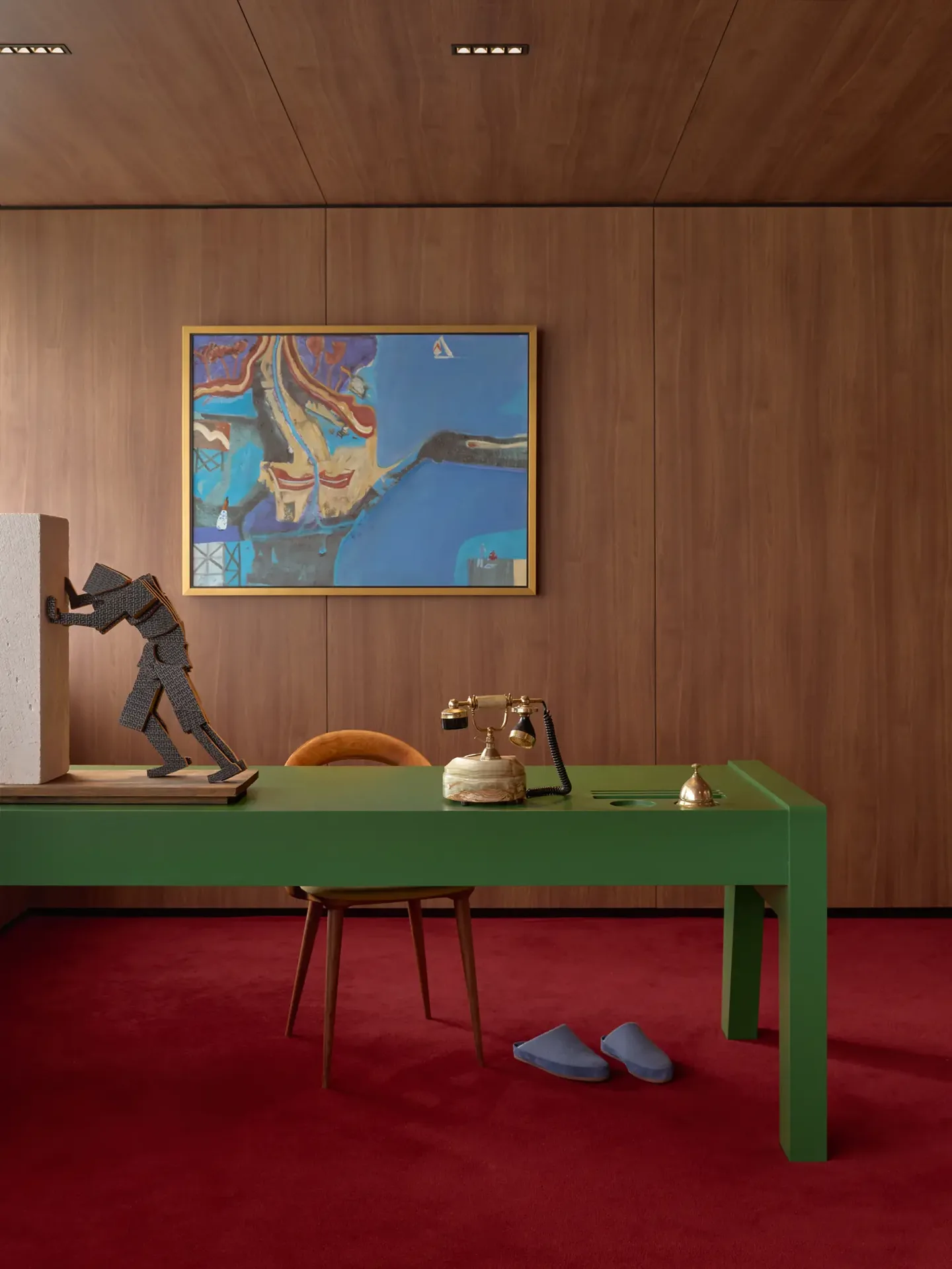
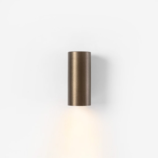
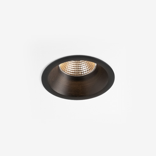
I wanted really minimal fittings because the ceilings are clad in timber. I didn’t want to just put a bunch of downlights into them.
MLP sent through some very minimal fittings and we planned them around the different ceiling panels. The aim was to achieve a very refined outcome.
Everything else in the space was a feature or a finish, so it was important that the lighting didn’t compete with that. There’s only one pendant over the table, and otherwise the fittings are deliberately quite understated.
The bathroom has a particularly strong lighting moment. Can you tell me a little about what you did there?
We did a modified version of the big ceiling fitting from Roxo. It needed to be RGB and controllable, so it can change colour depending on what you want.
It’s normally going to sit on that orange colour, but it can change to whatever you want. MLP needed to modify the fitting to allow for the RGB control, so there was quite a bit of work involved in getting that right.
The project has also been shortlisted for an IDEA Award. Can you tell me a little about that?
It was shortlisted for the IDEA Award for Workplace under 1,000 square metres, and I think it’s one of only two WA projects in that category.
Considering it’s such a small project and we’re going up against some massive studios, it’s honestly quite an honour.
Looking back at the project as a whole, what do you think makes it work?
The brief, the aesthetics, the references and the lighting approach all came together really well.
It was a really unusual opportunity because you don’t get many offices where you can design something like this. It doesn’t look like a traditional office at all. There aren’t computer screens everywhere, and some of the elements feel more like a house than a workplace.
When I look back at the photographs, it actually looks like the space does in real life. It doesn’t feel overly photographed or artificial. It genuinely looks like that, which is really cool.
Featured Products
Expert Advice
Let's work together.
Connect with us

Sydney
Perth
Melbourne
174 Cecil Street
South Melbourne VIC 3205
Sydney |
Showroom
507 Crown Street
Surry Hills NSW 2010
Brisbane
25 King Street
Bowen Hills QLD 4006